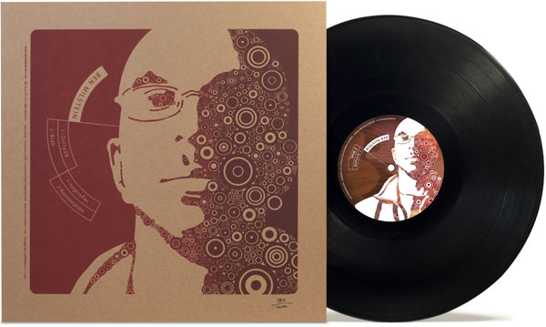
I was invited to work on this project by the recording artist, and the record label Buried In Time. This was Ben’s fifth EP and we were all excited that it was a record and that it would be a special limited run. Regardless of a tight budget we thought it would be great to make this something special.

I had worked with Ben previously designing and branding his website so I modified his existing logo and created the highly complex illustration of him to use as the main graphic. We had the jacket silkscreened in two colors of ink simultaneously in the draw-down so the right side is darker than the left. Each album was treated as an individual piece of art and was hand numbered to highlight the special nature of this limited pressing of albums.
Even though the illustration of Ben is detailed and complex, the overall design is created to be easily identifiable and legible in low light environments where DJs usually have to work.
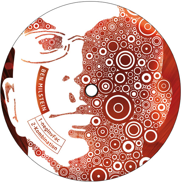
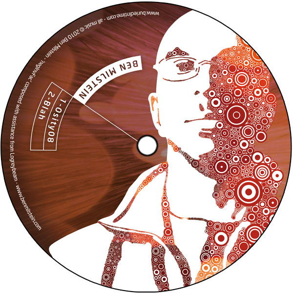
A CMYK representation of the graphic and simplified text is presented on the labels to maintain an easily identifiable mark that assists in discerning the A-side from the B-side.
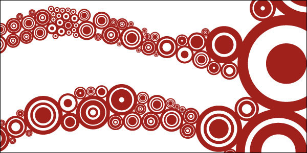
I wanted to provide an idea of the complexity and level of detail within the main graphic, so the next four images are a detail of the bridge of Ben’s glasses progressively zooming out.

The idea was to fill space with so many levels of minuscule dot
s that they would create a continuous line.
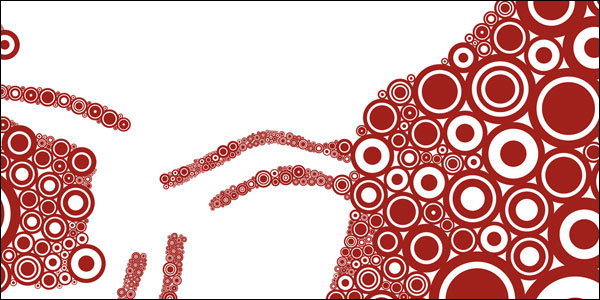
Similar to solving a puzzle, I would start with small sections and work my way along the borders then fill the sections in between until the two areas met.
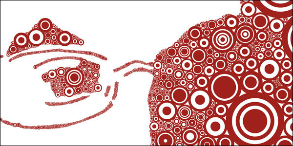
Eventually, after stacking thousands of dots the image took shape and a face began to appear.
If you are interested in purchasing Ben’s music on album or as downloadable files, you can find more information at Buried In Time.