Recently I was questioning if visually impaired people get to experience unique typographical design, and how typography translates to braille. From my research into braille typography I can identify at least two different areas that could be explored to bring some of the typographic excitement to braille that people with sight get to enjoy.
photo by Hisks – sxc.hu
I realized that I was only encountering the standard braille “dot” used in building, emergency and elevator signage. When I was researching this topic I saw that books written in braille and it reminded me of lines of code, or old computer punchcards. There is no variation in the size of dot, or the height of the dot or variance in the dot itself. The letterforms are unique of course, but I’m thinking something entirely different – braille fonts to enable braille typography and design. I question why braille always has to be a dot? If a visually impaired individual was in a new high–tech building couldn’t the signage for the blind represent the environment they are in? As long as the language pattern is correct, couldn’t they get the same message from a stylized shape other than the standard dot while adding an additional level of information?
I know it’s possible to create a variety of embossed shapes, although it might not be practical to print long novels in specialized fonts, but I also think that this concept could be achieved with embossing or a letterpress application for items like cards, posters, building signage or body modification.
The second area that I recognized was the typography itself, we all know that dense blocks of copy are more challenging to read than text that has been beautifully designed with emphasis and texture of different sizes and weights of type. So what would it be like to bring those concepts to a braille font? Here are some examples I have started to explore.
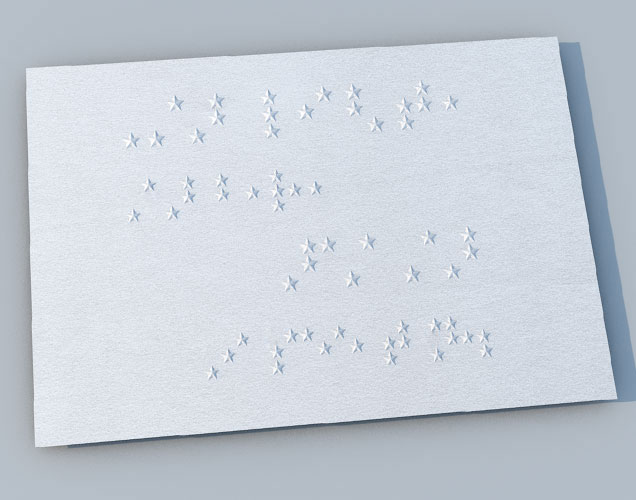
I call this braille font Constellation, because of the patterns it makes when text is written out. I’m sure a braille reader would be familiar with the basic shapes, and hopefully find some humor and delight in touching a group of stars that form a line of text. It would also be interesting to see if an increase or decrease the emboss on some words to act as light or bold faces.
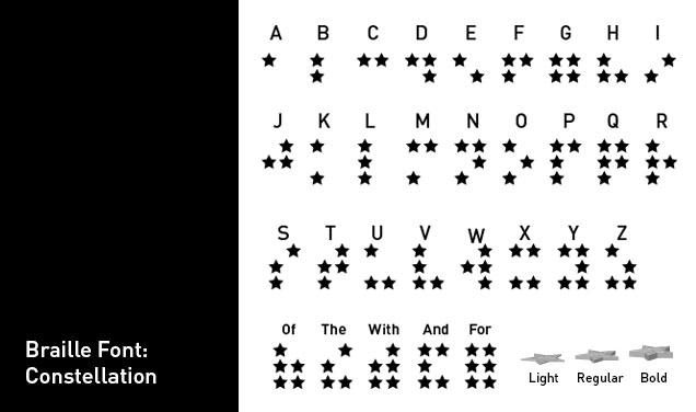
This example reads “Star light, Star bright, First star I see tonight.”
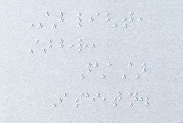
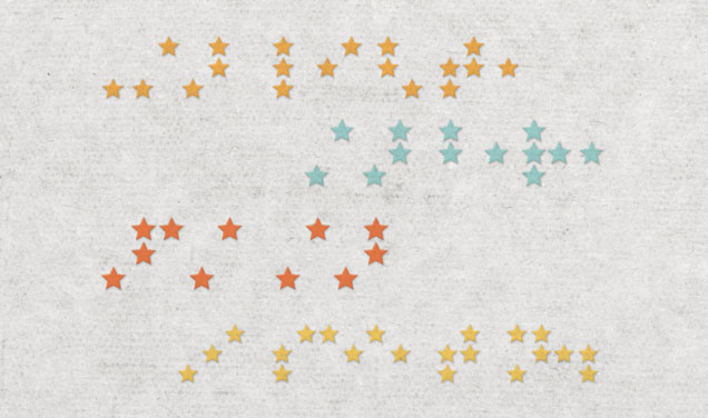
This treatment takes things one step further and plays with slightly different sized letterforms for each line, adding color would be for the folks with sight, but using printing techniques like thermography, foils or varnishes would provide a tactile element of discovery for the braille reader.
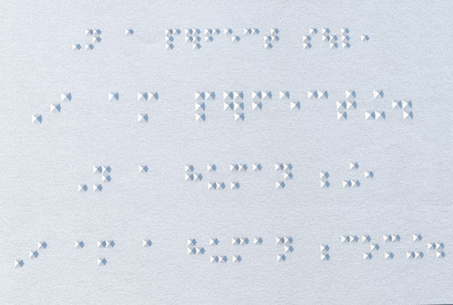
The Second concept I wanted to explore was this braille font I call Pyramid. If one could argue that something like a star would be too complex of a shape, or the face of a beveled star too flat for a braille typeface. Then why not take the classic braille dot, and reshape it into a point using a pyramid? The area of contact with the fingertip would be well defined, yet it would still conform to the necessary grid to make the letterforms of the alphabet.
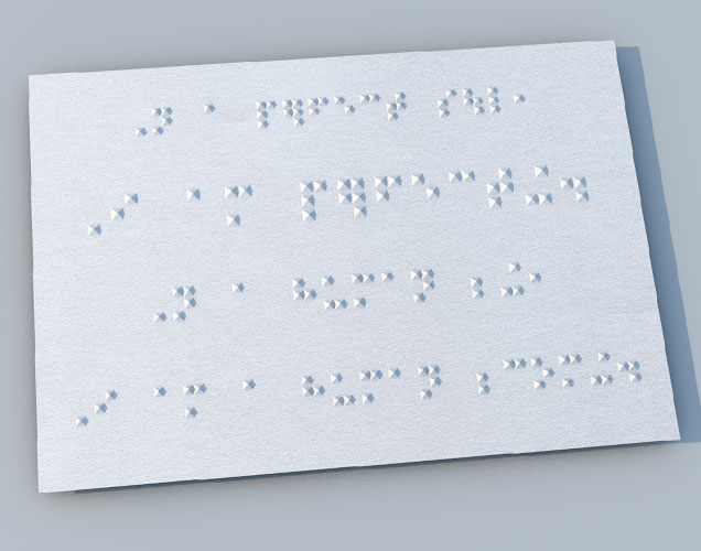
This example is from the Egyptian Book of the Dead and reads “Not a perfect soul, I am perfecting. Not a human being, I am a human becoming.”
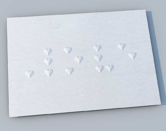
I call this braille font Love and see that it could have many uses that go beyond Valentines day.
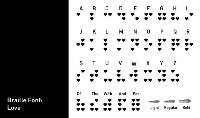
This example actually says “Love”, I think this could make a nice card for a person with or without sight, everyone can certainly get the message.
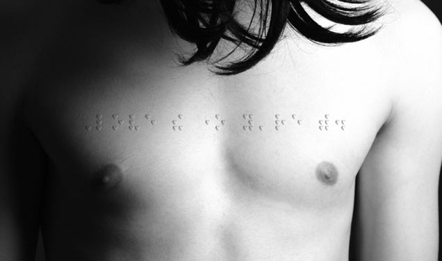
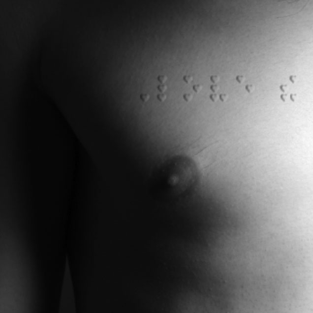
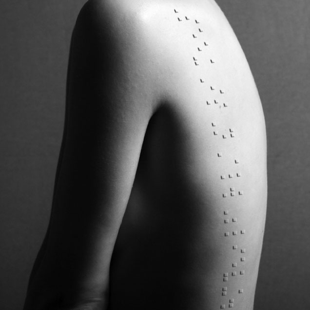
I also believe it is unlikely that the blind have an opportunity to enjoy body art like tattoos, but if we were to explore the idea of body modification for the blind a little deeper we find within the culture of body modification, scarification has become popular as well as very technical, and it is now possible for an experienced technician to re-create something like this example that says “Love the one you’re with”.

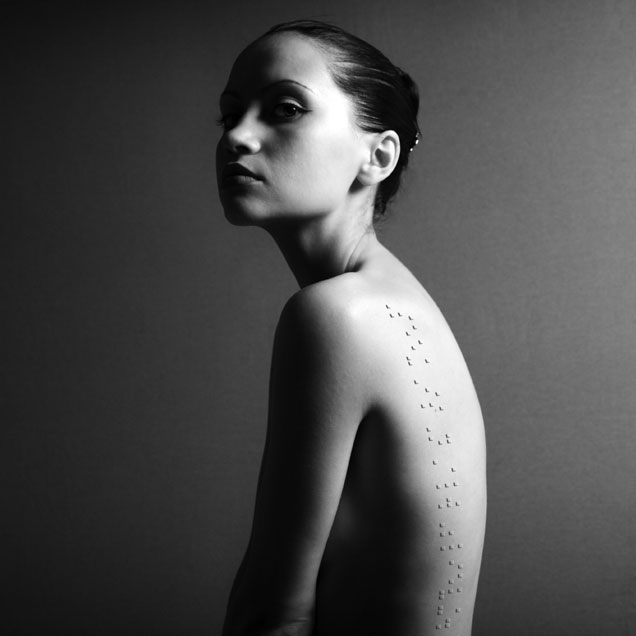
Here’s another example of a body modification using a rounded square ‘dot’ down the side of this model. It reads from top to bottom and says “Seeing is not always believing.”
If you have a moment please give me some feedback on this concept. Braille typography isn’t a topic of conversation that has ever come up for me in my design circles, and I would like to know your impression.
Thanks to Jeremy Gates for helping me with the 3D renders of these concepts.
Jan/1/2014
Great work! I love the attention you’ve payed to the mockups, and I think you’ve taken into consideration some important aspects like shape complexity, depth, and spacing.