 I was asked by Rena Jones, the founder of the Cartesian Binary label if I would help with the branding for her upcoming album Echoes. She wanted an image that focused on duality and there was part of a Rumi poem she had in mind that she wanted to incorporate, but beyond that the options were open.
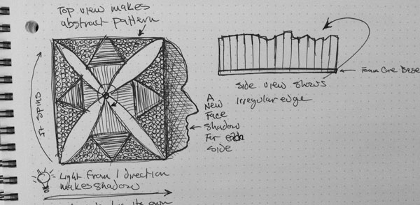
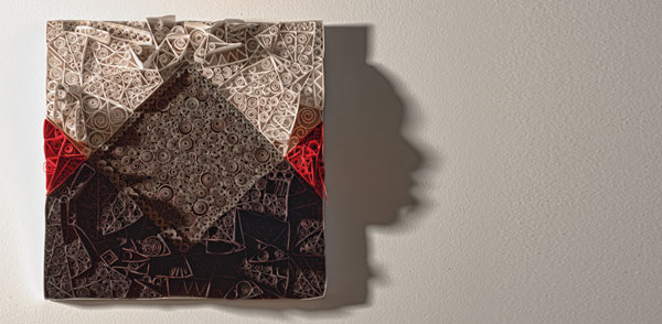
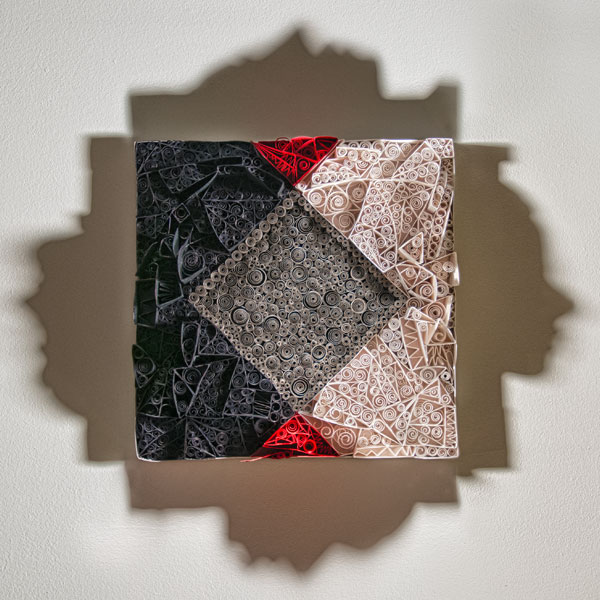
I had a few ideas in mind that I had been wanting to explore and I showed Rena the sketch below along with some test photos I had taken and got her approval to move forward with the idea to generate a 3D paper piece. The unique thing about this would be that it would have a primary design based on the concept of an echo, which expressed duality. But it would have a secondary goal of using multiple height levels to create silhouettes of Rena and other key musicians on the album when lit from one side.
I received profile photos from the key contributors, and I drew the outline of their individual profiles and divided them into multiple different overlapping pieces and began the long process of re-creating each section of each face as a 3D shape. It was also critical to calculate the correct positioning and height based on where the light needed to be, as well as making sure that none of the pieces were going to interfere with one of the other shadow profiles.
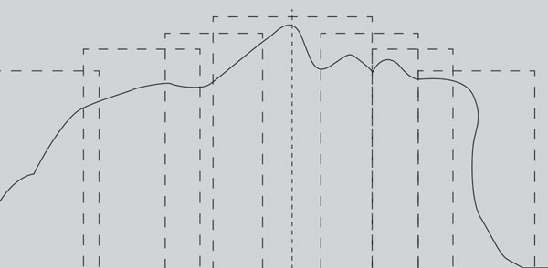
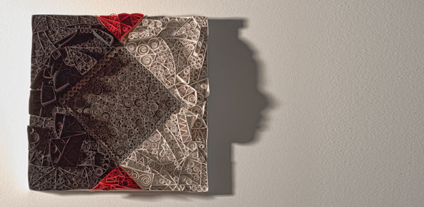
These photographs illustrates the how the multiple levels of paper are stacked in space in order to create the above profile when lit from the side.
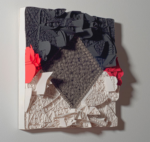

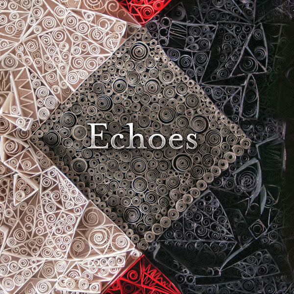
Once the pieces that formed the silhouettes were in place, it took several weeks of creating paper spirals and gluing them down in the process of filling the spaces between the main structures that make up the silhouettes. Each section had to be individually measured, constructed and glued into place before moving on to the next section, this gives the piece a crystalline feel and creates an organic complexity in the way the individual pieces overlap, intersect and interact on multiples planes within the framework.

I took two rounds of photos with slightly different lighting arrangements before I arrived at the final image. Due to the excessive range in contrast (black on one side, and white on the other) I took a bracket of 4 images for each silhouette and made an HDR of each one in order to show as much detail as possible within the image. These photos are from the first shoot and initial set of HDRs.
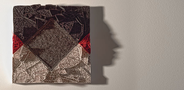
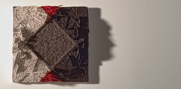
Due to some technical issues that arose from the initial photo shoot I decided to re-shoot under different lighting conditions, and re-create the HDRs. At that point I made a composite of the four processed images, paying attention to minimize the harsh shadows and bringing out as much detail as possible.
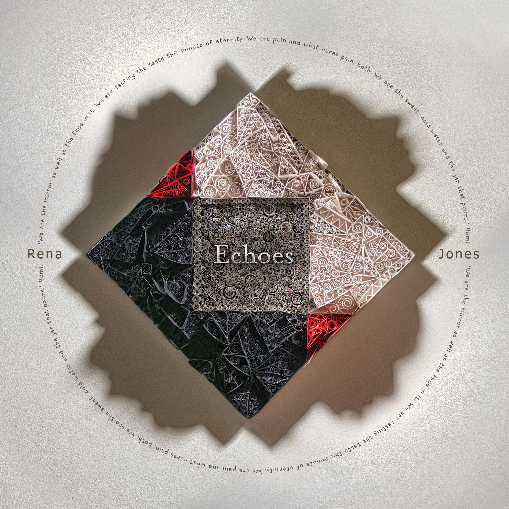
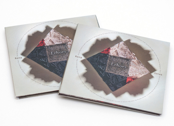
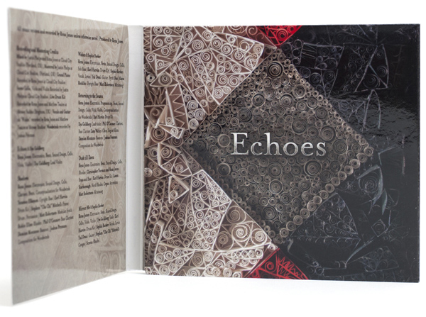
Once the hands-on, physical work was completed, it was time to work on the design for the CD and Album cover. I’m usually leaning toward san-serif type solutions, but this layout needed something more delicate so after a type study to determine what worked the best, Mrs. Eaves won out as the title text, while the font for the artist title is Tahoma Regular and the font for the Rumi Poem is Coop Forged. This close up image is on the inside of the CD package.
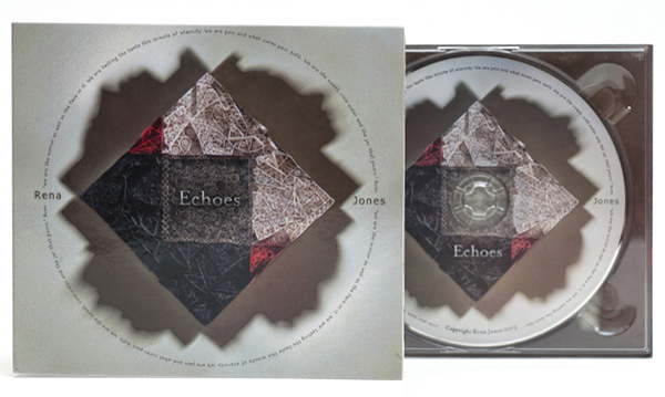
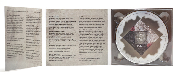
Here are some images of the final CD package.
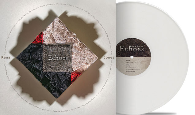
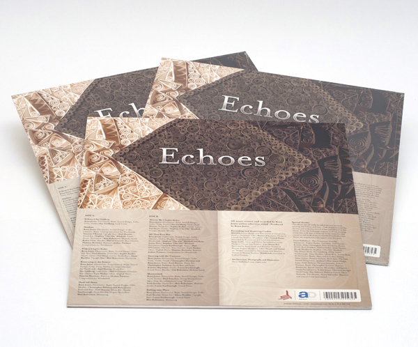
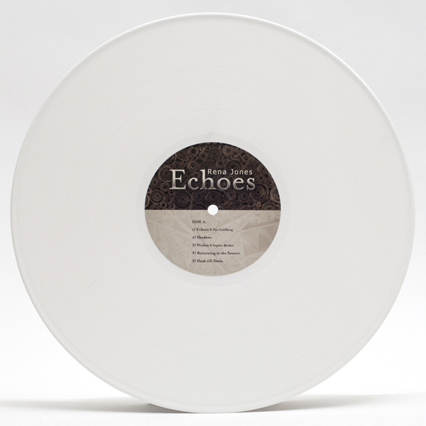
Here are some images of the vinyl album packages.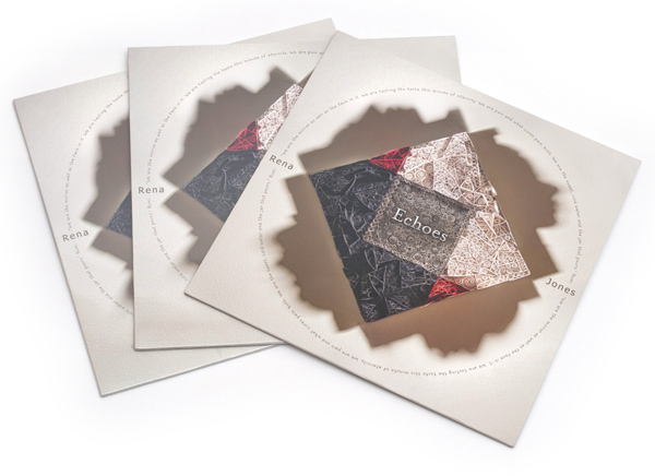
This project also won an Award of Excellence at the 2013 Rosey Awards. If you would like to know more about this honor, or the Rosey Awards please see the post.
If you are interested in purchasing Rena’s music on CD, album or as downloadable files, you can find more information and preview tracks at RenaMusic.com.