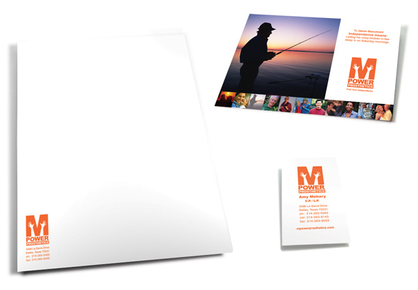
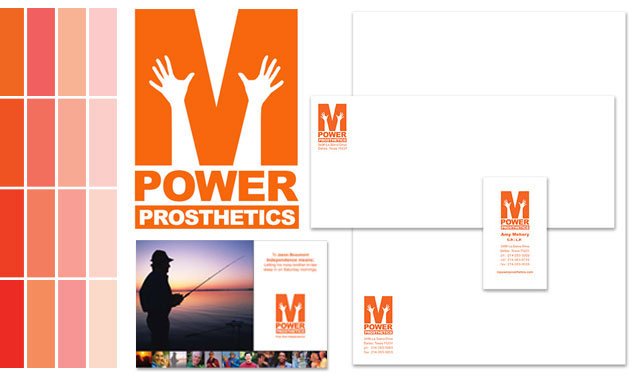
 As a new start-up company, M-Power Prosthetics needed an identity system created to differentiate them in the Dallas market. This included a business system, as well as postcard leave behinds for their network of local Doctors to provide to new paitents.
![]()
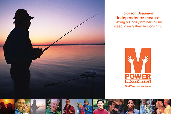
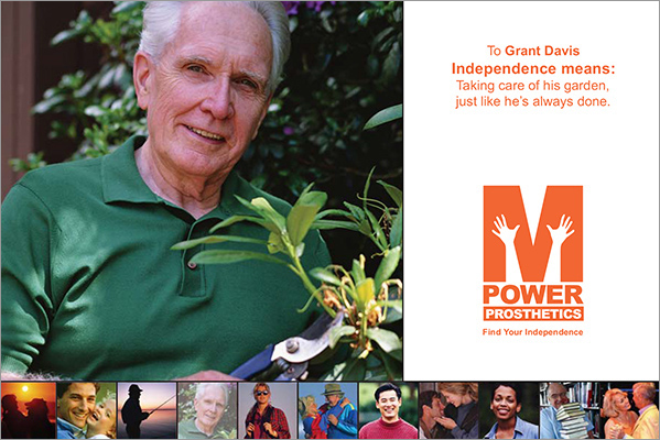
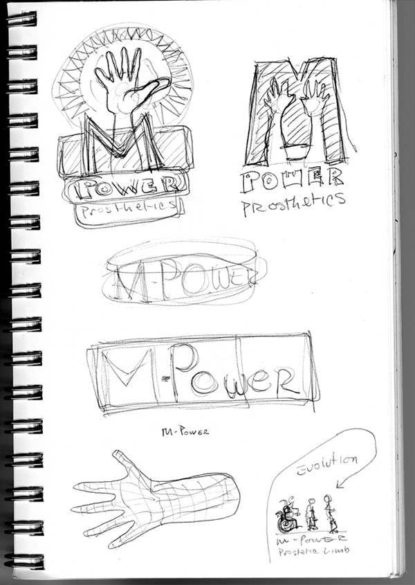
All of M-Powers client paitents have lost a limb and need a prosthetic to help them begin to normalize their life again. The sensitivities to the emotions of the client was a primary focus and the identity had to convey that M-Power understands the position of their clientele.
I presented these solutions to M-Power in the first presentation. The designs explore ideas ranging from the feeling of liberation after the paitent has been fitted with a new prosthetic, to the concept of creating a new limb that is as personal and unique to the client as their original limb.
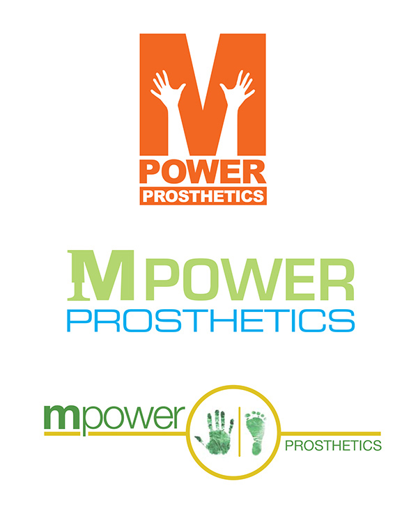
M-Power chose this design due to the upllifting feelng it conveyed. A combination of the bright orange, and the upreaching hands provided the inspirational message they wanted to convey to their clients.
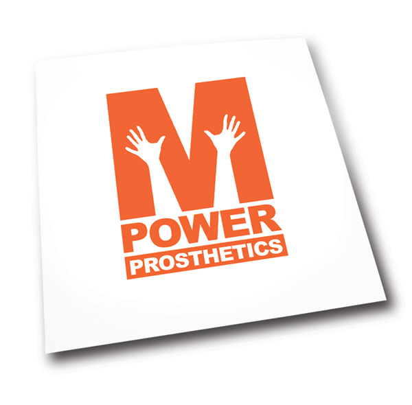
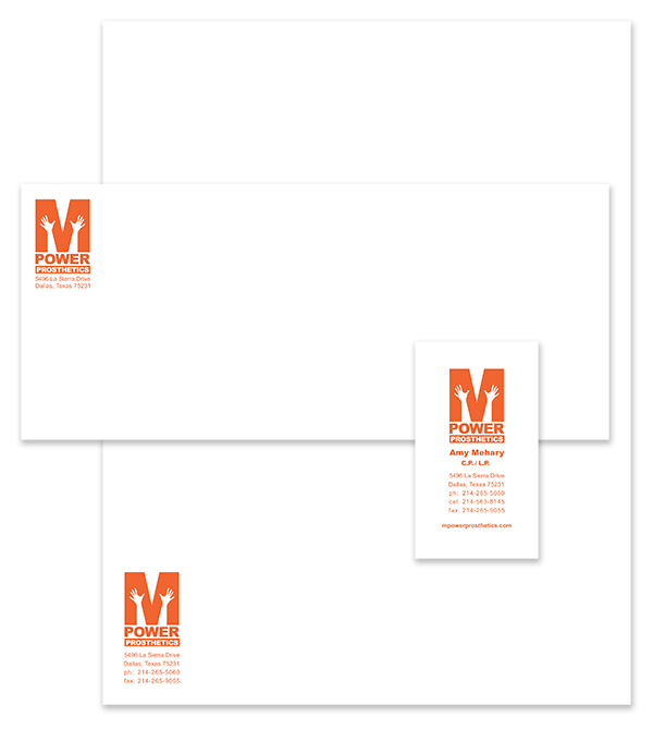
The logo was applied to letterhead, envelope and business cards to create a business system.
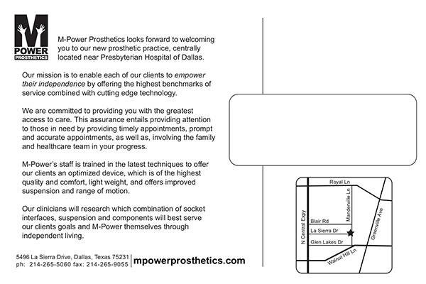
I also created the leave-behind post cards so local Doctors offices could recommend M-Power to paitents who had recently undergone an amputation.