I was invited to create a logo and brand materials for a non-profit program named Art Reaching Out or ARO – based in Dallas Texas. Art Reaching Out is a multi-disciplinary non-profit program that specifically involves female and underserved student groups in the creation of art pieces for public display using a STEAM (Science, Technology, Engineering, Art & Math) based approach. The branding needed to be fun and appeal to the younger audiences, as well as have professional appeal so they are recognized as being reliable and connect to an audience of financial donors, influencers and decision makers within the community.
The initial direction from the client was to explore the ARO / Arrow aspect of the name for the logo – although that was an obvious and reasonable direction, as I was sketching concepts it was my goal to incorporate another layer of information to keep the literal aspects yet increase interest and ownership of the brand.![]()
One interesting thing about Texans is their love of ‘all things Texas’ and their identity of the state symbols that are instantly identified with Texas. The ‘Lone Star’ is a primary symbol that many in Texas identify with and it has an interesting positive energy about it, so I recommended we focus on that concept.
I took those ideas and replaced the ‘A’ in ARO by combining the arrow and star together in the graphic style of a Celtic knot. This emphasized the energy of ARO, and how the organization brings many elements of the community together with their projects. The sans-serif typeface is professional, but the rounded ends give it a relaxed playful feel that appeals to the younger audience.
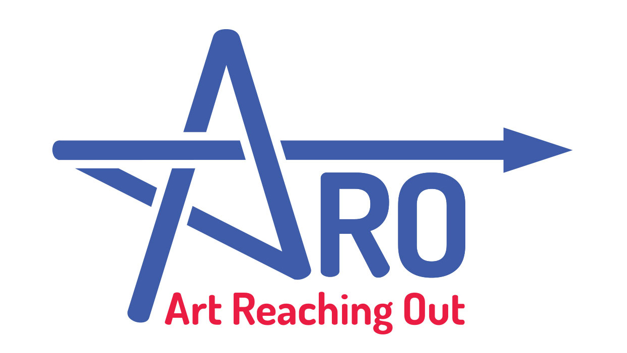
Two variations of the logo were created, one that is flat, and one that has dimension to it that is created by adding highlights to the letterforms. 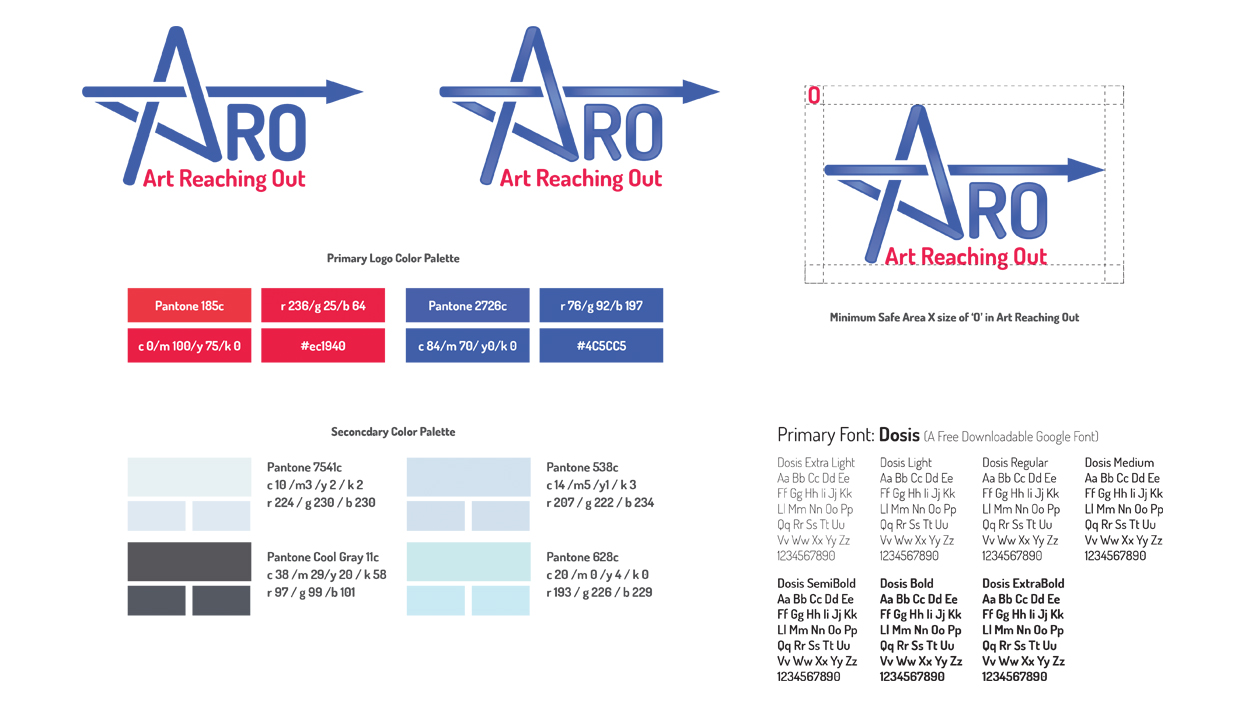
I also created a business card template for the client and ARO to use when the time comes to start networking and meeting collaborators. 