I was approached by Carlyn Ray to create a trademark for her glass blowing business, where she focuses on creating large glass installations for commercial and residential environments. Her logo needed to appeal to designers and commercial clients as well as individuals who had income to invest in artwork. We discussed that it should reflect Carlyn’s positive values of community involvement, hard work and emphasize stability, precision and inspire client trust.
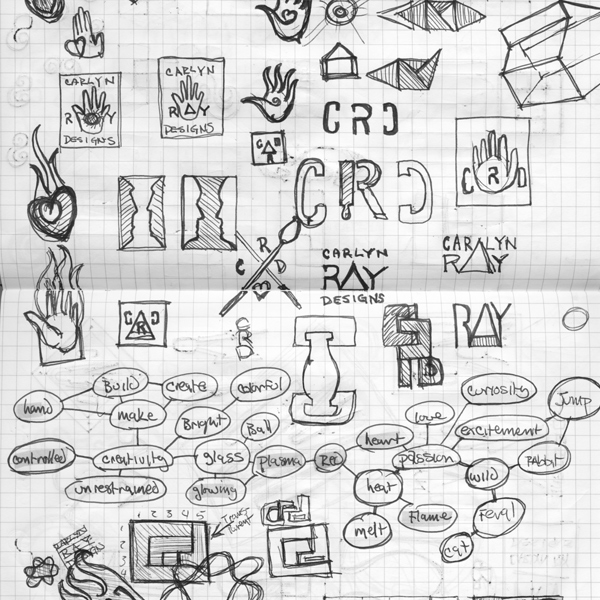
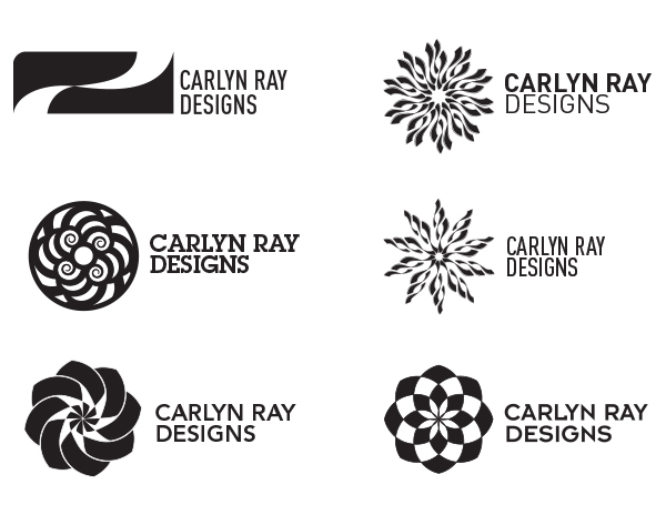
I started by creating several mind maps, and sketching based on the initial direction that I thought would lead toward viable solutions. My first explorations leaned toward a typographic treatment, and exploring the unique tools of a glass blower. Carlyn not only creates her pieces, but she is a designer as well, and she is working on releasing a product line so the mark needed to say more than ‘glass shop’ it had to express her values to the target market in a broader sense.
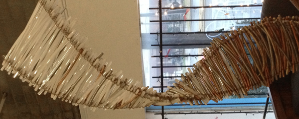
For inspiration Carlyn sent me two images that provided the cornerstone of the final design. The natural flowing lines of a twisting ribbon of glass, and the organic helical spirals that are created within Carlyn’s work became my focus.
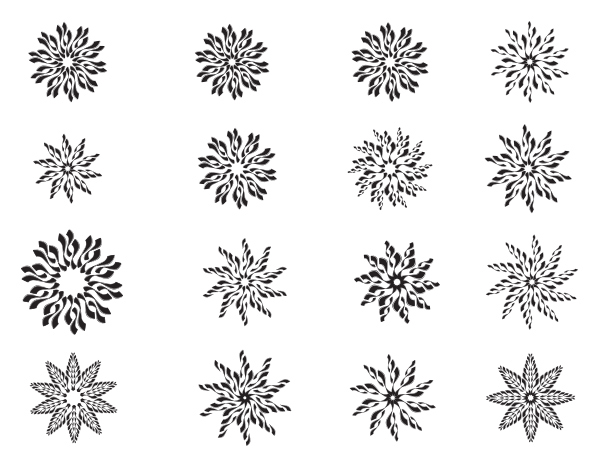
In my design exploration I multiplied several of these ribbon shapes to create a sun symbol where the “rays” represent the heat and energy from the furnace and the constant spinning motion of the molten glass that’s being formed into an object. I generated many variations before arriving at the best expression of the rays working in harmony.
I presented several other design treatments in round two that also explored a range of font options, the logo in the upper right was chosen, and we explored type a bit further.
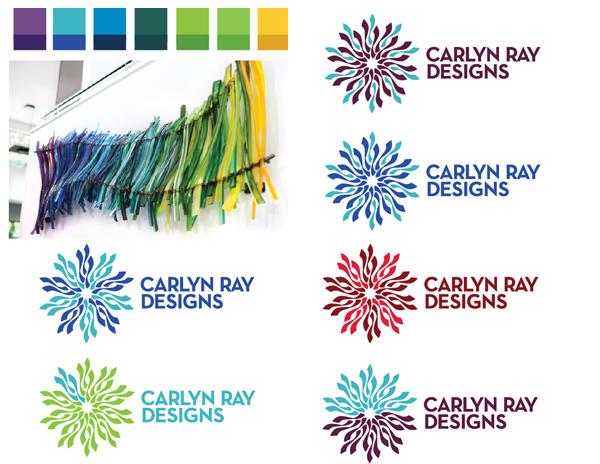
Due to budgetary concerns with printing multiple colors, I limited myself to a two color solution and I explored several different directions. Carlyn’s glass work is so colorful I referenced several pieces and arrived at many different color options, and it was clear two colors would be more than adequate. These are just two examples of the initial color exploratory where patterns as well as the color range were considered.
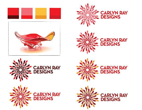
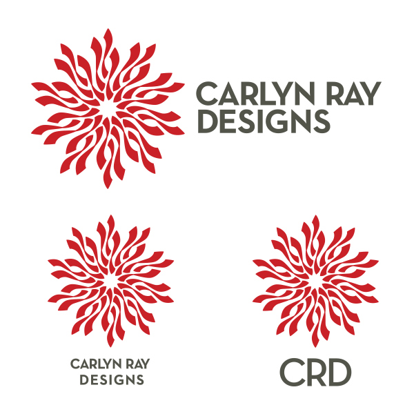
Several different color combinations and patterns were explored and we arrived at a red and grey color combination due to it’s professional and contemporary appearance that is confident, vibrant and maintains a sophisticated professional presence. Carlyn wanted to address a need to have different variations of the logo, so I was designing three marks with a horizontal, stacked and monogrammed type treatments.
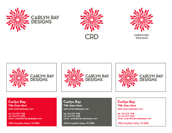
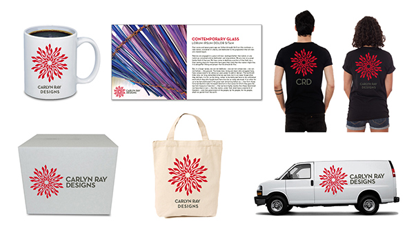
I was also showing the logo in context by providing a business card design, as well as the logo on different types of common collateral to give an overall impression of how the mark would function in real world applications.
With the rays being a single color they work together to create a strong holistic mark, and the organic energy of the rays is balanced with sophisticated geometric precision of the type treatment.
RD