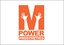
 M POWER
Prosthetics Development
Power is a prosthetics company in Dallas Tx. and they needed an aspirational logo that expressed the freedom their customers feel after they’ve been helped by M Power.

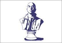 BEN MILSTEIN
Piano Teacher / Professional Musician
Ben Milstein is a piano teacher and musician, this logo expresses Ben’s tie to classical music and composition in a tongue and cheek manner.

 OAK STREAM
Financial Investors
This Dallas based investment company needed a logo that conveyed their established history and projected an institutional feel. The mature oak tree provided a message of brand stability and assurance to their customer base.

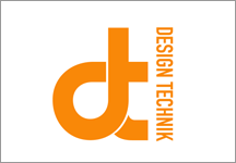 DESIGN TECHNIK
Acoustics & Lighting Consultants
Design Technik needed a clean brand mark that mirrored their technical refinement. I chose a highly geometric typeface and modified it, combining letterforms to convey efficiency and precision in this logo.

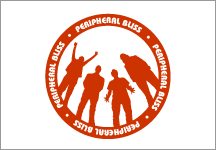 PERIPHERAL BLISS
Musicians
The Portland based band Peripheral Bliss needed a logo that represented their low key style. I silhouetted them to mimic their usual back-lit stage set up.

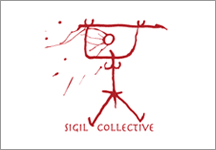 SIGIL COLLECTIVE
Visual Art Collective
Sigil Collective needed a mark to represent their process of creating artwork. This logo was created by deconstructing the words “Sigil Collective” and creating the primitive character from the letter forms.

 BeMD
BeMD
BeMD Be Market Driven was a side-project business group of several individuals who started producing knowledge based materials and were in need of a brand mark that would identify the broad range of collateral they were producing.

 BUDDHA HAND
Massage Therapist
This was for a massage therapist who needed to establish a logo and business system. This was my favorite of the many logos I presented although it was not her final choice. It represents all of the elements and references old alchemical wood-cut prints as well.

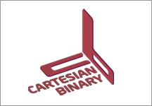 CARTESIAN BINARY
Record Label & Distribution
This mark for Cartesian Binary was built on a grid and shows the corner of a cartesian graph with x-y-z co-ordinates present in the final mark.

 E3
E3
EARTHEARTEARTH
This was one of several designs created for a fledgling clothing retail brand.

 NOSIE XT
Test and Phase Noise Measurement
Noise XT competes in the highly competitive market of electronic test equipment. They help develop phase noise systems to measure electronic signals and frequency synthesis to enhance radar receptivity for military and aerospace applications. They needed a logo that matched their technical expertise and could be recognizable when placed on their hardware products.

 OAK STREAM
Financial Investors
This is one of the logos that was developed for Oak Stream based on an early brief where they wanted to be positioned in a more contemporary light. It wasn’t right for their target market in the end, but I like the way this turned out.

 SOUL TECHNOLOGY
Technology Group
This logotype was created for a technology group that would experiment with electronics and music development.

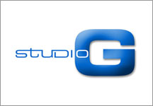 STUDIO G
Yoga & Metabolic Typing
Created for Greg Owen at Studio-G he needed a logo for his yoga and metabolic practice that bridged the gap between strength and elegance. The connected type in the word ‘studio’ reference the way Aribic letterforms flow together.

 FORTUNE TELLER
SINGLE COLOR PRINT / DIE-CUT DESIGN
This project was an exercise in creating a mark that could be printed in a single color, as well as have the option of being die-cut from a sheet of paper.