Cannabis Branding & Packaging Materials
Now that Cannabis is legal in several states there’s a wide ranging need for branding and packaging materials that differentiate the unique qualities and services this new industry has to offer. My client named their company Odyssey due to the long journey they’ve been on over the years perfecting the science and art of extracting cannabis resins from the plant material. Their primary direction was to explore a space theme and I also came up with some alternate concepts that related to the company name Odyssey.

After reviewing some NASA mission patches I decided that using the patch idea as a long reaching concept would allow the client to use the initial logo for the company and initial product offerings. If they wanted to expand their business beyond extracts in the future, they could modify the primary logo to reflect the offerings of the new product or service while keeping a common visual language that their customers could recognize.
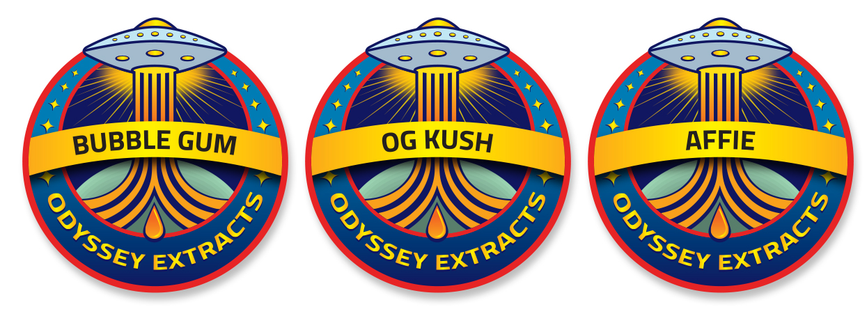
The packaging for their product is generally a small puck-shaped container so each icon has to work at a size of about 1.25 inches. Each product looks very similar (an oily amber mass), so it is necessary to to clearly identify each product on the label. In order to address this concern, I placed a banner across the badge containing the name of the product within that is easy for the dispensary staff to read.