 Greg Owen was on the verge of launching Studio G, a metabolic typing and yoga studio in Seattle. He needed to develop a brand mark as well as a website and some supporting collateral pieces to drive traffic to his online presence.
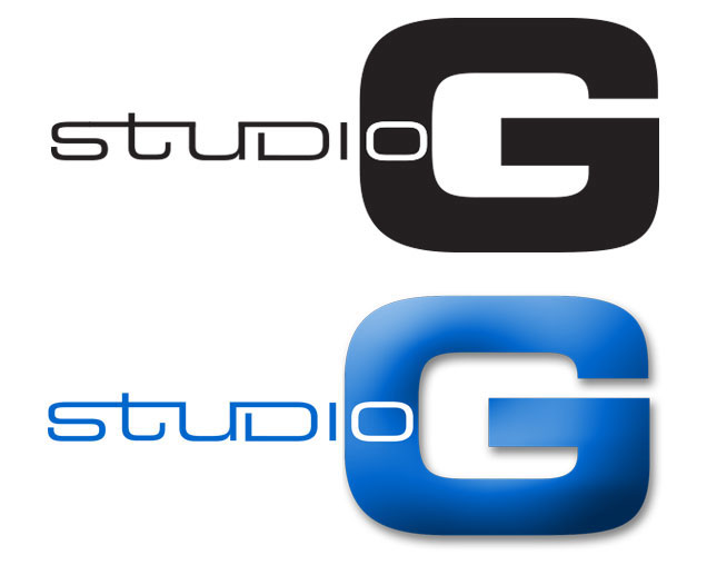
We started the project by developing a logo in order to tell the brand story and connect with an identity for Studio G. The mark would need a unique combination of traditional and contemporary elements to express the broad range of offerings provided by Studio G.
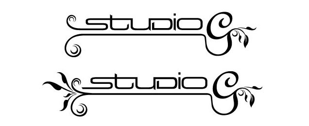
I explored several options centered around a custom font, and arrived at a few treatments that Greg asked me to explore further. These ranged from the delicate and organic options, to solutions that were more bold and masculine in the font selection.
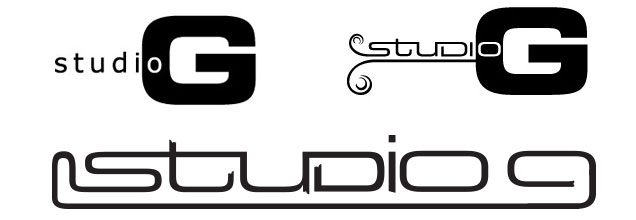
The client liked the interaction between the customized text and the bold “G” – without the additional organic elements. The final result is a nice balance of feminine and masculine fonts in a treatment that joins them both together.
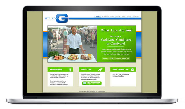
Once the logo was approved, we developed the website to share the benefits of Metabolic Typing, and provide information on how to sign up for Yoga class. There are six main sections to the site detailing the services offered by Studio G. We utilized a Flash banner on the home page to tell his story and funnel visitors directly into the main areas of his site. If you would like to see more, please feel free to visit Studio G.
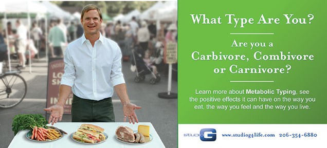
In order to drive traffic to the website I developed some postcards based on the messaging from the Studio G website. These postcards were distributed to locations throughout Seattle and gave potential clients an opportunity to reach the studio.