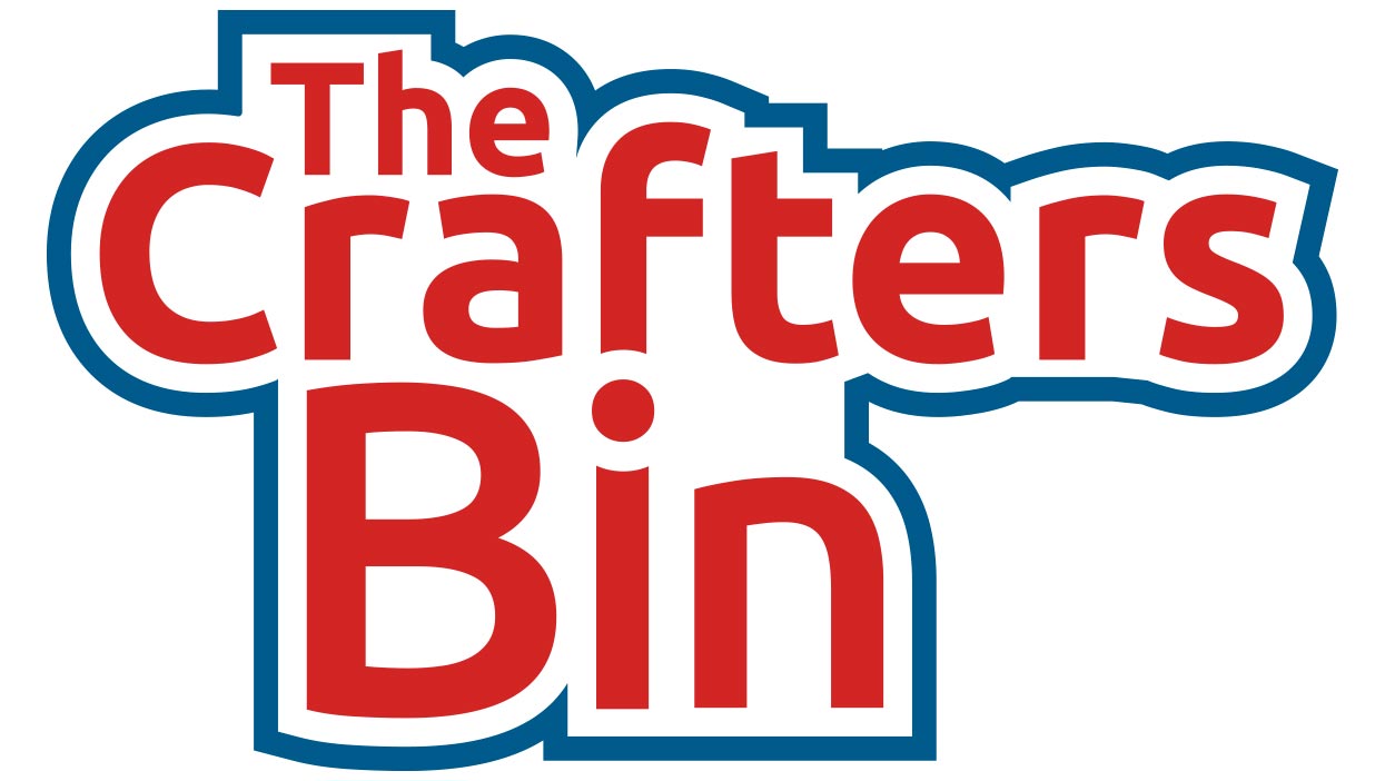
The Crafters Bin needed to differentiate themselves from their competition and they invited me to create a professional logo for their online community. The primary focus of the Crafters Bin is to provide an environment where artists with varied interests can come together in one place and sell their crafts.
In the beginning this appeared to be a straight forward project but as I started to research the wide variety of available products it became clear that there were many unrelated crafts available. It became clear in my initial exploration that one single craft couldn’t be represented because it would alienate the other craft offerings that fell outside of the specific icon I chose to use.
I also explored the idea of using multiple icons to represent the wide variety of crafts that were available, but these soon became cluttered and difficult to read at smaller sizes. My solution to this problem was to create a typographic based logo that focused on the name of the organization as the primary direction.
I explored several different approaches and typefaces, and arrived at a solution that nested the words together. I also subtly manipulated the original typeface and applied a strong outline that contained the text. The red, white and blue color scheme we arrived at is striking and bold and implies that the crafts are made in the U.S.A.
