This project was crafted for the owner of a handyman business in Portland, Oregon. He needed to upgrade his logo and get a new run of business cards and I was happy to help. He is a Japanese immigrant named Shinichi Tsuzuki and he has lived in the U.S. for several years now acclimating to our culture, learning the language and doing business.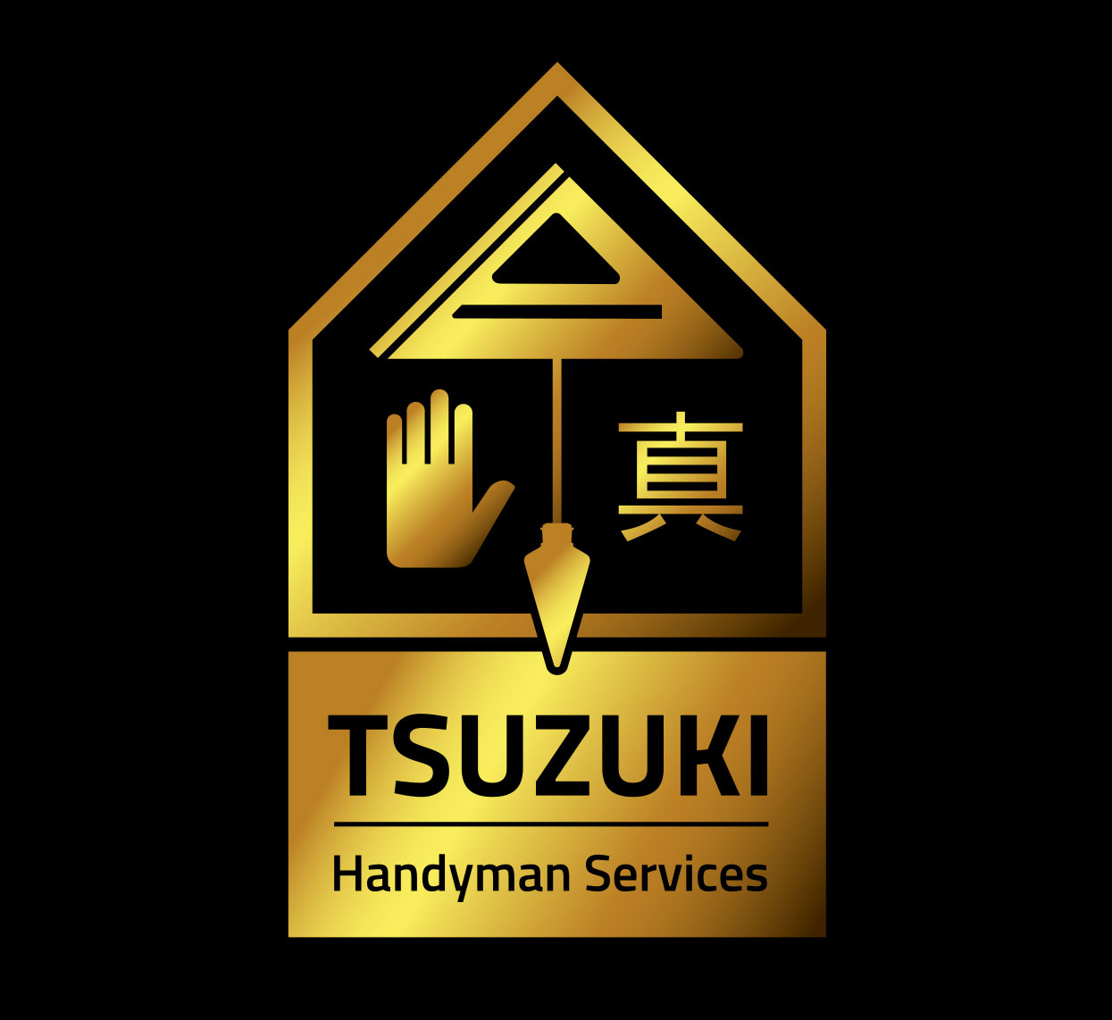 In my research I found that most handyman logos are extremely generic and focus on the well known tools everyone has used at one point or another. In order to create a logo that was unique and stands out from the others I decided to focus on the quality of work Shinishi does for his clients.
 I arrived at the core principals that his work is Square and True – both terms for honestly and quality as well as common language to describe carpentry. I took those ideas and conveyed them with a carpenters square and a plumb-bob. I placed them in a classic house shape and then added the hand to symbolize that he does a lot of the work by hand. After some research I chose this Kanji symbol because it means square or true and unbeknownst to me, it also happens to be the way Shinichi spells his name in shorthand.
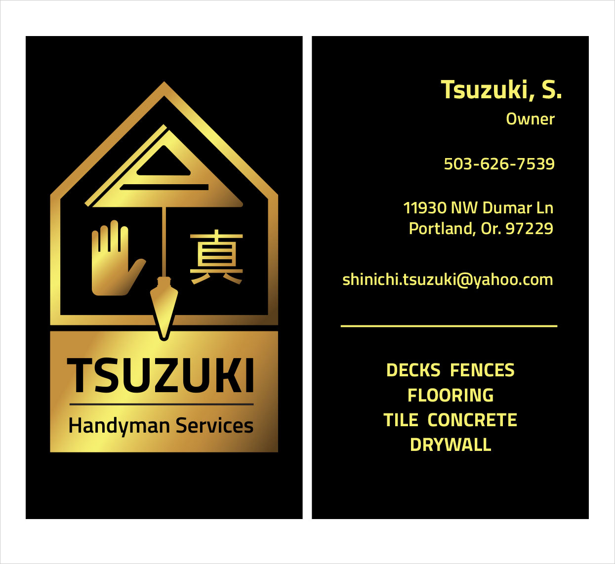
All together the logo creates a visual narrative that says Shinichi does quality traditional work that is square and true. The primary concept of the logo that Tsuzuki provides quality work was enhanced by applying a brass like finish to the mark. When the business cards were printed I had a spot varnish applied over the logo to increase the impression of a shiny metal finish.