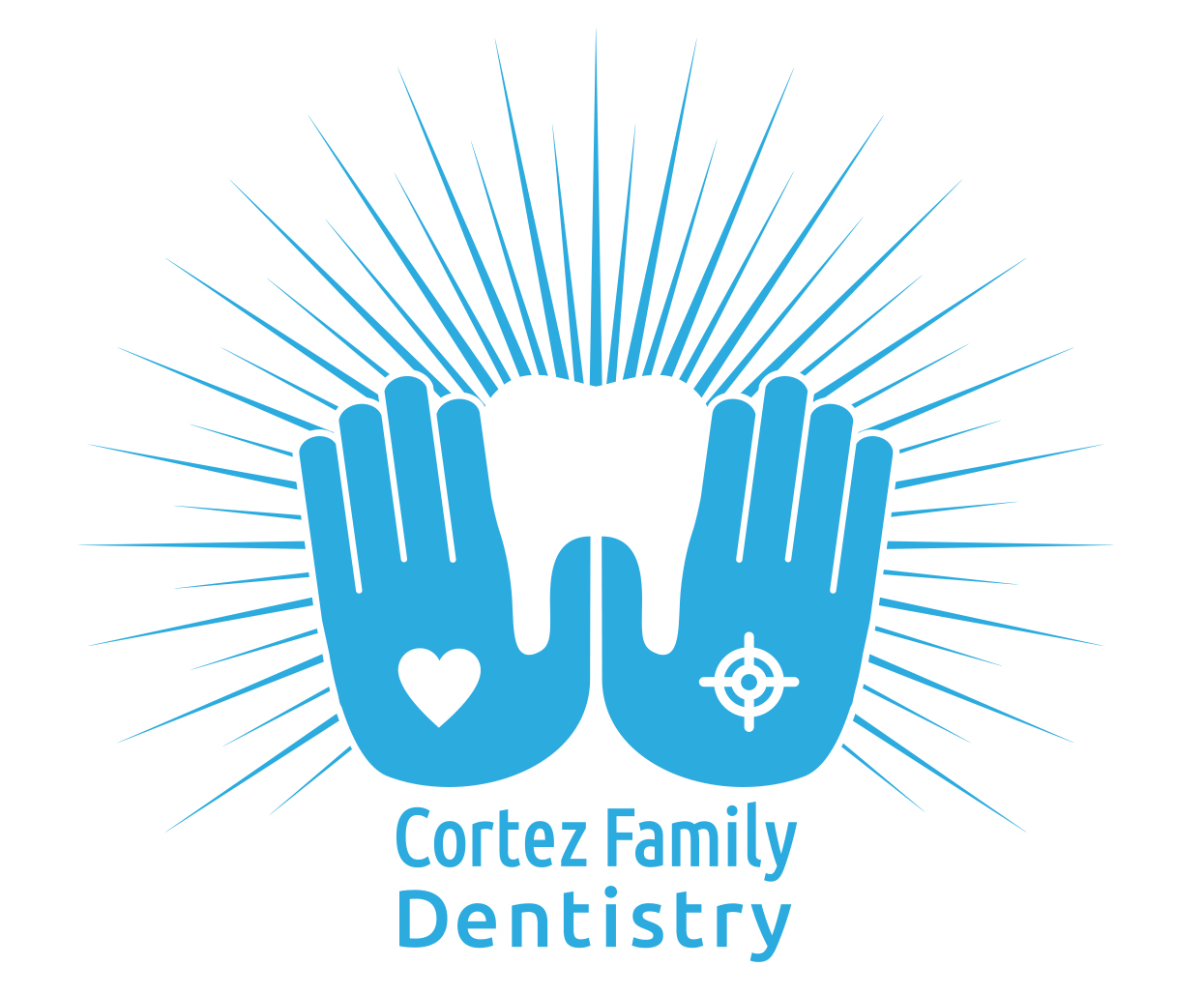
This is a logo for a dentist in Cortez Colorado that utilizes negative space to form a tooth icon. In the design phase of creating the primary logo for Cortez Family Dentisitry I created this mark as one of the options for the primary logo. The clients chose a different logo mark that related to the culture and history of Cortez and appealed to the larger community. Two years later they were still thinking about how to use this mark and they came back and asked if we could clean this up and use it to brand their team shirts for a marathon some of the employees were participating in.
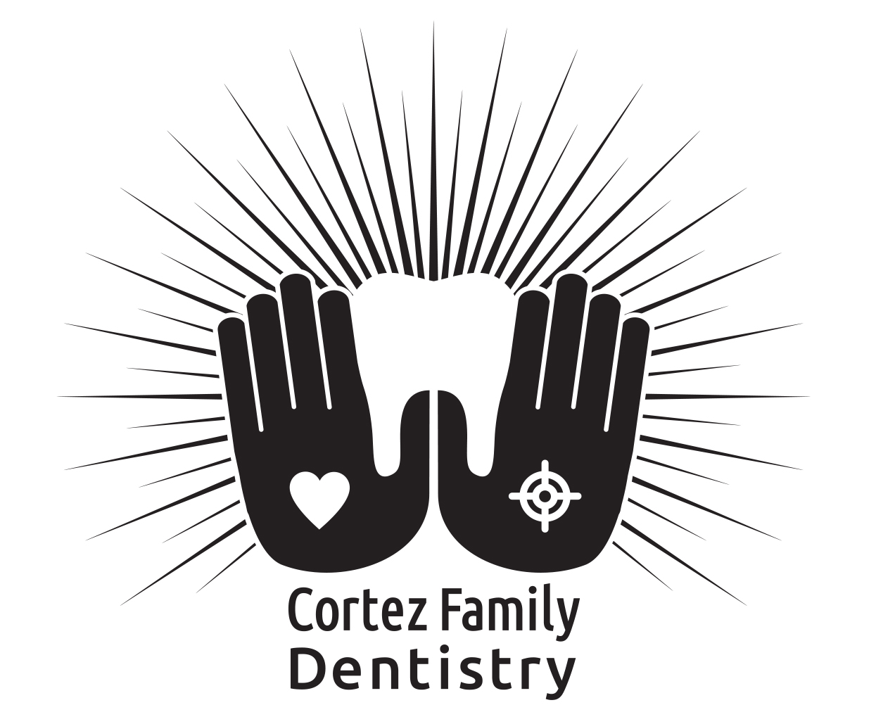
 Some important adjustments were required to get this ready for printing due to it never getting past the sketch phase. I presented some color options for this mark, and to keep a visual tie to their existing brand I used the same typography from their existing logo. Once those aspects were approved, I cleaned up the vector art making sure to get it presentable for public presentation and then created mechanical files for the printer to use.
Dentist logos almost require a toot icon, and this logo is intriguing and memorable. Creating the tooth out of the negative space that the hands make is a unique approach, and it tells a story of dental care that is precise and compassionate. I’m pleased that the client was able to utilize this logo two years after the first presentation and that it can support the primary logo that they currently use for their business.