This brand refresh was commissioned by tenBridges, a code development firm in Portland, Oregon that specializes in mobile first and complex web application development projects. tenBridges had outgrown their original brand identity and recognized the opportunity to develop a new identity with a forward look toward the future of their business and the clients they want to attract.![]() The main focus was on developing a new brand identity that reflected their creative approach and professional skill set. Once that was complete we created a business card and letterhead to support their new brand identity. To support the primary brand elements I created a secondary color palette for web usage and a style guide that contains all of the important information required to stay consistent with their new look and feel as they start to apply their branding to upcoming projects.
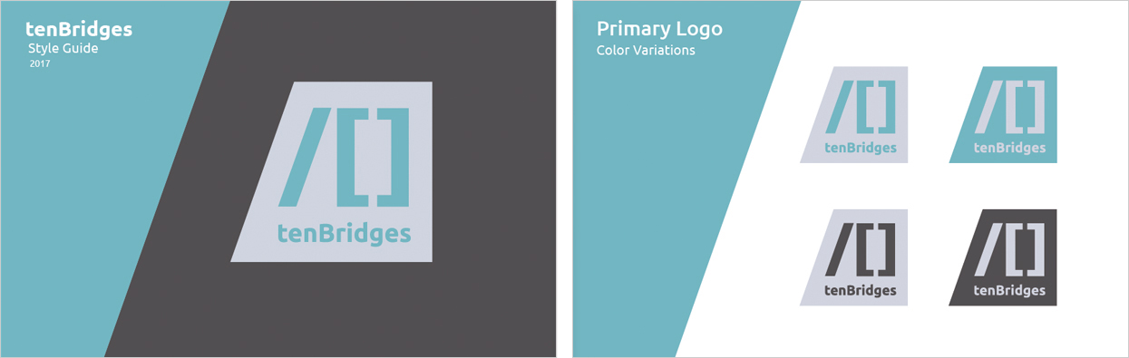
The main focus was on developing a new brand identity that reflected their creative approach and professional skill set. Once that was complete we created a business card and letterhead to support their new brand identity. To support the primary brand elements I created a secondary color palette for web usage and a style guide that contains all of the important information required to stay consistent with their new look and feel as they start to apply their branding to upcoming projects. After presenting multiple logo options all with differing approaches, the trapezoid logo was chosen to be developed as the primary brand mark. The overall shape started as a square to emphasize the solid professional nature of the work tenBridges provides. The left side is canted, creating a trapezoidal shape that aligns with the forward slash. The final mark leaves the impression of stability and reliability.
The logo references common elements of code mark-up with a forward slash “/” and brackets “[]” creating the numeral 10. Their coding expertise is also re-enforced by presenting the company name in what is referred to as “camel case” where the following words in a closed compound are capitalized. Code is usually written in all lower case, and camel case assists in reading multiple words that are compounded together.
 The business card also references the canted angle in the logo with a folded die-cut flap. The card holders name is on the front of the flap, and when the card is opened the personal contact information is revealed in a field of blue. The address and website is on the back of the card.
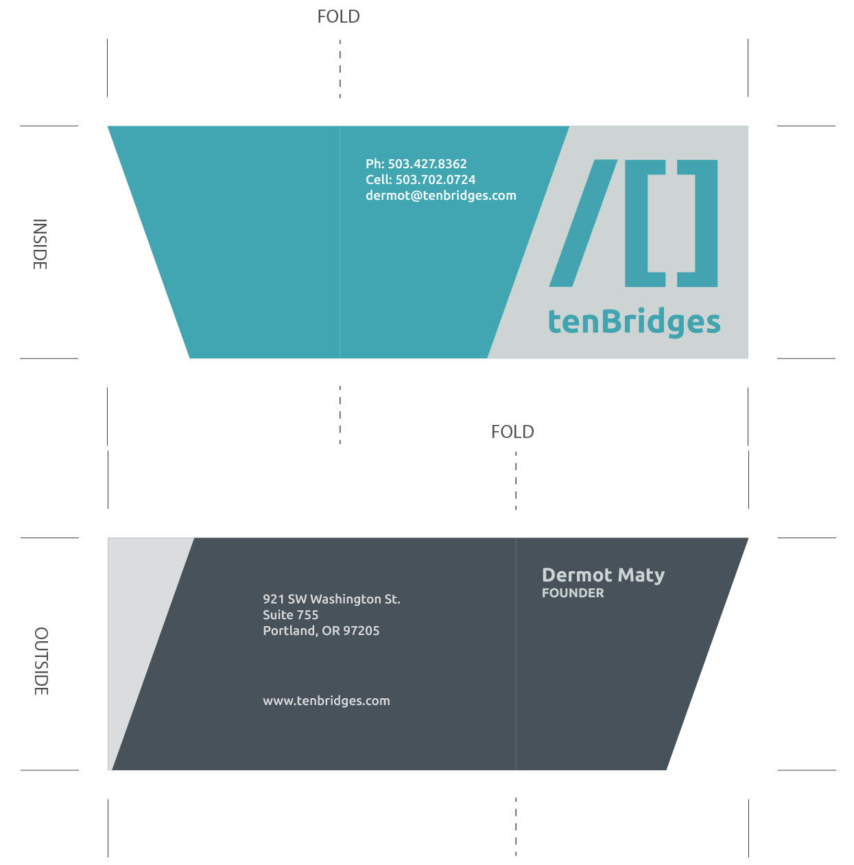 The letterhead also references the angle of the ‘anvil’ shape and has a large grey field on the cover sheet, and a small corner field on the content sheets.
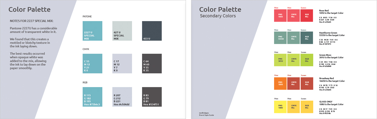
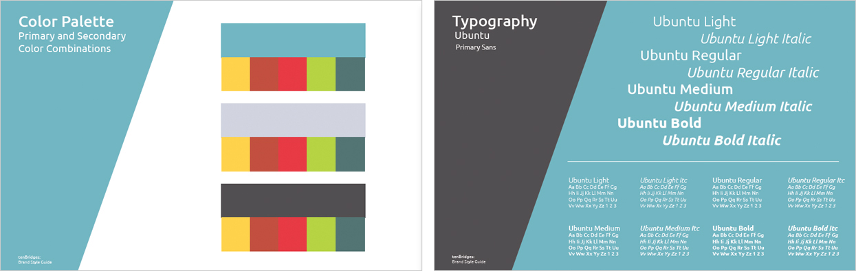
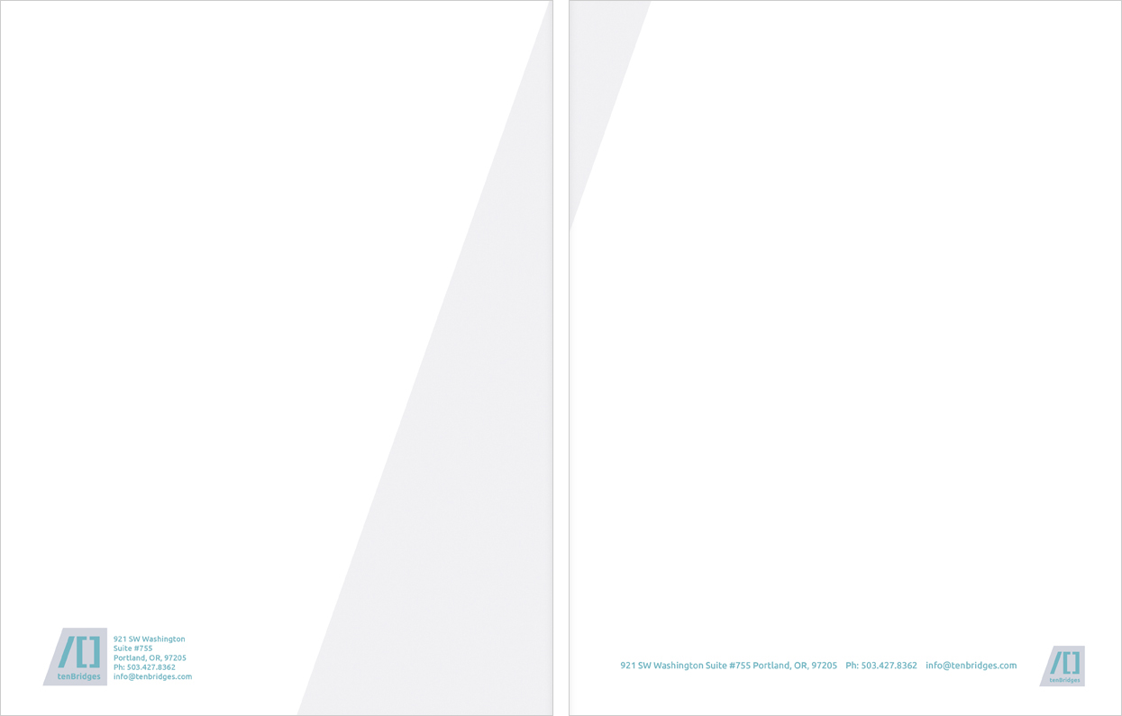 The style guide consists of ten pages that display the several iterations of the primary logo design as well as secondary logos for small applications and black and white versions for single color usage. Essential considerations such as spacing, and color mixes for the primary and secondary colors are specified as well as information on the typeface.